I was thinking about this lately, but I always loved the look of the PS2. I I think the black and blue color scheme works really well. And I like the two levels like the top and the bottom part of it.
Second to this, I think the Dreamcast looks really great. The angles on it make the console look so compact. The orange light on the console is placed really well too.
What do you like?
Loved this lil guy, small, sleek, simple and played great
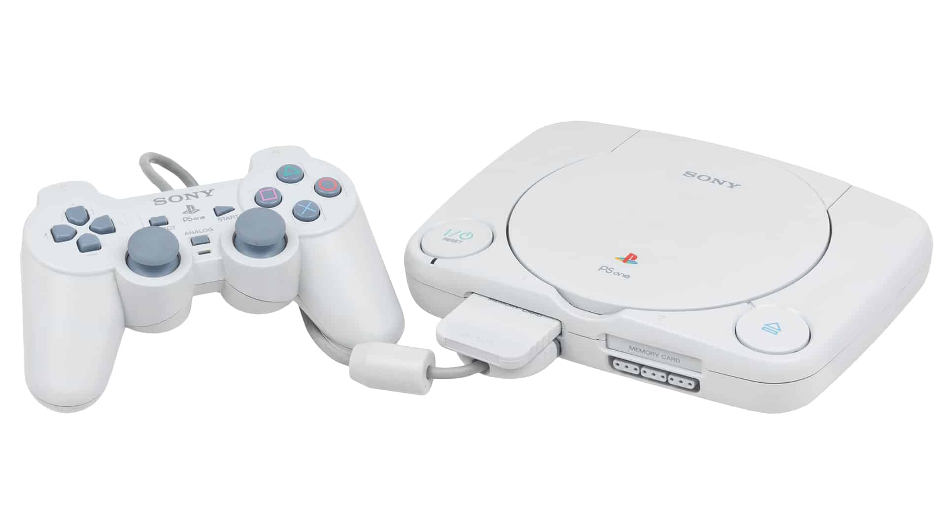
I completely forgot about this one. It was so cute!
Nintendo GameCube
Purple, had a handle for carrying and the gray perfectly offset the purple
For me all colors are cool. This machine is gorgeous.
Physical console design? Atari 2600. The black slots and wood grain front with the sleek angular design is still peak console styling IMO.
User interface design? Xbox 360 Blades. Hands down. Easy to navigate, easy to understand, and good potential for minimal advertising abuse.
My fist general purpose console was the Sega Master System. It had a flowchart displayed on the top telling you how to use it.

It might not have been pretty in the traditional sense but I loved it.
Looking back on it the chart was somewhat misleading, the console had two built in games that were only accessible if you didn’t insert a cartridge or card (Hang On, and Safari Hunt), and a third that also needed a controller connected and a few buttons held down when you turned the system on (snail maze).
I have one of these. I got it at a yard sale as a kid. I don’t think I knew about the built in games.
The original Wii
I liked the way it would just swallow the discs whole
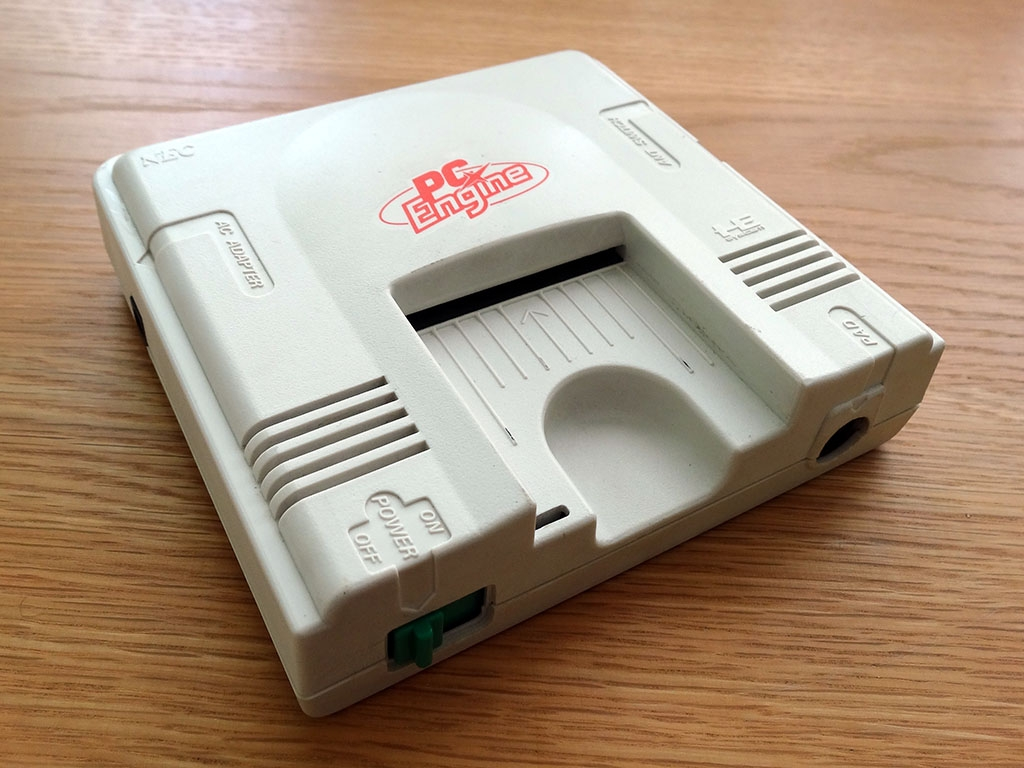
The PC Engine is definitely a contender. Looks like something from the set of Star Trek TNG, takes unique little cards, and is extremely tiny* and compact. (particularly for a system that was ahead of its time) I think it’s neat!
*roughly the size of a sandwich
Black Dreamcast is pretty sexy.

The GameCube in a cool color (like Spice Orange). Not just because I like orange. It has great contrast with the grey and black parts of the console. And the whole thing is wrapped up in a tidy, aptly-named package!
Console: Nintendo Wii, it is small, and has a sleek vertical design.
Handheld: PSP 2000 and 3000, it is just a beauty at any angle.
Not sure if it counts (given this community), but the original PS4 immediately became my favorite console design. I am generally a fan of simple, elegant, soulless aesthetics.
Gamecube.
2nd would be PS Vita (original OLED version).
The PS5 is probably my most hated look and shape. Just an idiotic and clunky design, and moronic decisions to go white.
I considered the GameCube too. I probably played that the most out of that generation of consoles.
Amstrad GX4000! Fantastic looking machine, sold mine a few years ago, which is a bit of a regret. https://en.wikipedia.org/wiki/Amstrad_GX4000

That looks like it would give me at least 25 hp when I pick it up.
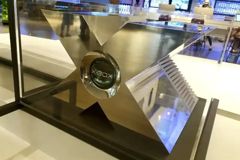
For actually released consoles, I think the Famicom is just neat looking

I also like the Famicom. I almost put it in the post.
Even though I had the model 2 growing up, I really like the model 1 Genesis/Megadrive. Had a kind of futuristic/sci-fi vibe to me.
Super Famicom or ‘this is cool’ Saturn

