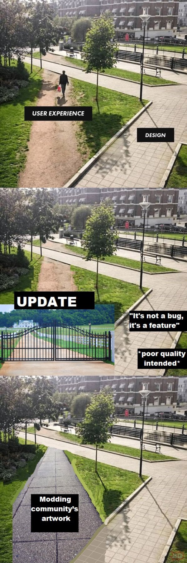
Should include a concept to reduce impervious surfaces in modern times. User experience is not the only variable.
Whenever that happens, the design is wrong.
Fixed. Added a wall with razor wire on top to prevent this.
Ah yes, the hostile architecture approach.
In IT, sometimes there’s security reasons for the designed detour.
But then good design would completely obstruct the shortcut from the user’s view.
change log: We’ve adjusted the 20 year old UI to better reflect modern aesthetic trends that our new hires learned in school.
I think it’s from the time where things were done manually and round lines were a pain to draw. There wasn’t AutoCAD and undo features in a neat software 🤣
I, unfortunately, have to use GitHub at $DAYJOB and this is me. I navigate most of the webpage via the URL bar now.
Basically, let’s say I’m working on a repo
github.com/tomato/sauce/and want to navigate to the Releases page.Via the webpage:
- Type
github.cominto the URL bar. - Don’t find
tomato/sauce/in the list of recent repos, even though it’s the only repo I work on. - Click on some other repo that’s at least in the
tomato/org. - Navigate up to the
tomato/org. - Find the
sauce/repo in the list. - Traverse half the fucking screen to hit the “Releases” heading in the middle of the About-section.
Via the Firefox URL bar:
- Type
gi→t→s→r→. - Hit Enter.
I admit, it’s hard to compete with the latter, but I wouldn’t know how to navigate that way, if the former wasn’t so terrible.
Hopefully somebody else $DAYJOBs at GitHub and will see this.
What kind of sicko try to find their repos from the recent list on the main page??
This is me, but with my work’s Azure DevOps. Nice to meet a fellow auto-complete bro.
- Type
“What the user needed” / “What management demanded”
That’s right, it goes in the square hole.
That’s ancient.
Uhh, so looking carefully at the picture, it appears they shouldn’t have bothered with the inner pathway at all, and should have just connected the bridge over the canal (?) in the background to whatever is under the camera.
Not only does the current design fail to provide a short path in demand, it leaves a goofy little boulevard behind the benches in what appears to be a dense, desirable urban area where you shouldn’t waste space.


